Wednesday, February 25, 2009
Suburban Declaration
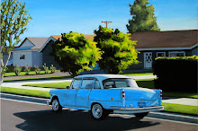
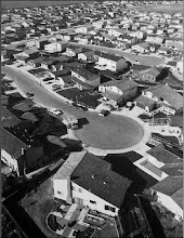
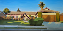
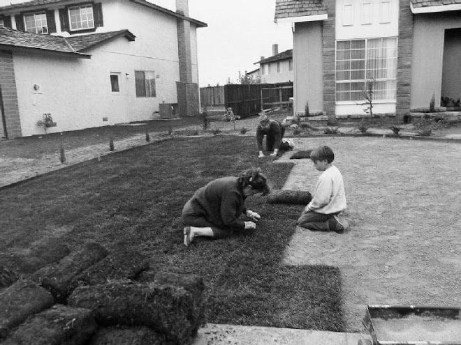
Growing up in Norton all my life, I have settled into and seen suburban lifestyle. Instead of trying to grasp something only abstractly for my concept, I wanted to dive into something with multiple sides. I plan on addressing the conformity of suburbia now and in the 1950s as well as the 1920s. I also plan on addressing family roles, common themes, and the negative side of suburban lifestyle using art, photography, and literature.
Thursday, February 12, 2009
Concept Critique #1: George Tooker
A supermarket could be considered the watering hole of a suburban town. Family members go on shopping dates to pick out cereals, frozen pizzas, and slabs of meat. They all grab their carts, travel down aisles and aisles of food and drinks, and then make there way to the register to pay for their items. George Tooker's "Supermarket" depicts this suburban supermarket with great realism. He establishes the monotonous aisles with continuous colors and simple numbers. He takes the reader to a familiar atmosphere of food shopping with his smooth technique.
The foreground of the painter seems to draw the viewer first. We see a small group of shoppers, all of which look bored. Some are wearing similar clothes. Their lack of enthusiasm is present in their faces as well as these dull clothes. One of the subjects even has bed-curlers in her hair, creating a sleepy feeling.
The eye then moves up toward a window where a man is glaring out. He appears as though he is leering at the shoppers and appears like an employee of the supermarket. There is another man behind him, who is also wearing the same exact shirt, a possible indication that both are workers in a break room in their uniforms. The background does not escape the conformity of the foreground. The aisles all appear as though they have the same item. The colors are all the same and the only difference between the aisles are their numbers.
Tooker seems to be making a statement about this constant conformity of suburban supermarkets. Their dull colors, and repeated architecture are targeted in the composition. Their endless size is also emphasized in the background that appears to be never ending. The subject matter is not hard to see and Tooker's criticism is apparent in this composition.
The foreground of the painter seems to draw the viewer first. We see a small group of shoppers, all of which look bored. Some are wearing similar clothes. Their lack of enthusiasm is present in their faces as well as these dull clothes. One of the subjects even has bed-curlers in her hair, creating a sleepy feeling.

The eye then moves up toward a window where a man is glaring out. He appears as though he is leering at the shoppers and appears like an employee of the supermarket. There is another man behind him, who is also wearing the same exact shirt, a possible indication that both are workers in a break room in their uniforms. The background does not escape the conformity of the foreground. The aisles all appear as though they have the same item. The colors are all the same and the only difference between the aisles are their numbers.
Tooker seems to be making a statement about this constant conformity of suburban supermarkets. Their dull colors, and repeated architecture are targeted in the composition. Their endless size is also emphasized in the background that appears to be never ending. The subject matter is not hard to see and Tooker's criticism is apparent in this composition.
Critique: Mind's Eye.
Scenery can often create a mood in its viewer. A beach may create a warm, enjoyable feeling. A dense fog may depict an ominous mood. In Brett Gamache's "Two Paths", a viewer sees a simple scenery in a New England-like forest possibly in the summer. The colors and simple technique create a serene mood. The paintings natural colors almost give off the pine-wood smell as it transports the viewer into this quiet, summer, day.
In the middle of the composition is, what appears to be a broken down shack, the clear focal point. Not only is its placement important in the emphasis but the colors inside the shack also draw attention to it. With blues and whites, Gamache draws the eye to the dark, brown shack, which lies at the connection of the two, dirt pathways. The bright colors in the dark shack are juxtaposed together to draw more attention to it.
The viewer then follows the two pathways, specifically the one that winds up to the top right portion of the painting. This pathway's hue changes, as it undergoes the cover of trees and then returns to a bring opening. This bright opening gives off a joyous, summery mood which contrasts with the dark cover of the trees.
The background of the painting reminds the viewer they are deep in the forest, as the horizon contains trees and what appears to be large hills. The two pathways continue off in different directions, continuing in harmony with the forest colors.
Although the oil painting technique seems to involve messy dabs that go in different directions, the image's colors create a serene mood and relaxes the viewer, allowing them to become lost in the deep forest, following a possibly never ending pathway.
Subscribe to:
Posts (Atom)